#Complete Coding with Random Forest
#Load and Explore Dataset import pandas as pd from google.colab import drive drive.mount('/content/drive') #Loading the dataset # Load the training and testing datasets df = pd.read_csv('/content/drive/MyDrive/Machine Learning Lab/Customer Churn Prediction/customer_churn_dataset-training-master.csv') #Basic Inspection # Show basic info print("Training Data Shape:", df.shape) # Show first few rows print("\nFirst few rows of training data:") print(df.head()) # Check for missing values print("\nMissing values in training data:") print(df.isnull().sum()) df.shape #(440833, 12) df.info()
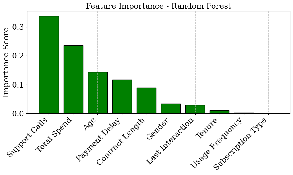
df.describe() #Check Actual Column Names print("Training Columns:\n", df.columns.tolist()) #Training Columns: ['CustomerID', 'Age', 'Gender', 'Tenure', 'Usage Frequency', 'Support #Calls', 'Payment Delay', 'Subscription Type', 'Contract Length', 'Total Spend', 'Last #Interaction', 'Churn'] #Data Preprocessing from sklearn.preprocessing import LabelEncoder # Drop CustomerID df.drop(columns=['CustomerID'], inplace=True) # Remove rows where target 'Churn' is NaN df = df[df['Churn'].notna()].copy() # Convert 'Churn' to int df['Churn'] = df['Churn'].astype(int) # Encode categorical columns cat_cols = ['Gender', 'Subscription Type', 'Contract Length'] le = LabelEncoder() for col in cat_cols: df[col] = le.fit_transform(df[col]) # Split features and target X = df.drop('Churn', axis=1) y = df['Churn'] #Counting Class Values import matplotlib.pyplot as plt import seaborn as sns # Plot class balance plt.figure(figsize=(6, 4)) sns.countplot(data=df, x='Churn', hue='Churn', palette='Set2', legend=False) plt.title('Customer Churn Distribution') plt.xlabel('Churn (0 = No, 1 = Yes)') plt.ylabel('Count') plt.xticks([0, 1], ['No Churn', 'Churn']) plt.grid(axis='y', linestyle='--', alpha=0.5) plt.tight_layout() plt.show()

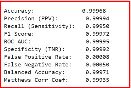
#Train-Test Split from sklearn.model_selection import train_test_split X_train, X_test, y_train, y_test = train_test_split( X, y, test_size=0.2, random_state=42, stratify=y ) #Train Random Forest (with class_weight) from sklearn.ensemble import RandomForestClassifier rf_model = RandomForestClassifier( n_estimators=10, class_weight='balanced', random_state=42, n_jobs=-1 ) rf_model.fit(X_train, y_train) y_pred = rf_model.predict(X_test) #Evaluation with Full Metrics from sklearn.metrics import ( accuracy_score, precision_score, recall_score, f1_score, roc_auc_score, confusion_matrix, balanced_accuracy_score, matthews_corrcoef ) # Metrics accuracy = accuracy_score(y_test, y_pred) precision = precision_score(y_test, y_pred) recall = recall_score(y_test, y_pred) f1 = f1_score(y_test, y_pred) roc_auc = roc_auc_score(y_test, rf_model.predict_proba(X_test)[:, 1]) balanced_acc = balanced_accuracy_score(y_test, y_pred) mcc = matthews_corrcoef(y_test, y_pred) # Confusion matrix tn, fp, fn, tp = confusion_matrix(y_test, y_pred).ravel() specificity = tn / (tn + fp) fpr = fp / (fp + tn) fnr = fn / (fn + tp) # Print results print(f"\nAccuracy: {accuracy:.5f}") print(f"Precision (PPV): {precision:.5f}") print(f"Recall (Sensitivity): {recall:.5f}") print(f"F1 Score: {f1:.5f}") print(f"ROC AUC: {roc_auc:.5f}") print(f"Specificity (TNR): {specificity:.5f}") print(f"False Positive Rate: {fpr:.5f}") print(f"False Negative Rate: {fnr:.5f}") print(f"Balanced Accuracy: {balanced_acc:.5f}") print(f"Matthews Corr Coef: {mcc:.5f}")
#Confusion Matrix import seaborn as sns import numpy as np import matplotlib.pyplot as plt from sklearn.metrics import confusion_matrix # Title title = "Confusion Matrix - Random Forest" # Set style plt.rcParams.update({ 'font.size': 18, 'font.family': 'serif', 'axes.titlesize': 18, 'axes.labelsize': 18, 'xtick.labelsize': 18, 'ytick.labelsize': 18 }) # Get confusion matrix cm = confusion_matrix(y_test, y_pred) # Get class labels labels = sorted(y_test.unique()) # or ['No', 'Yes'] if binary # Plot fig, ax = plt.subplots(figsize=(8, 4)) cmap = sns.color_palette("crest", as_cmap=True) sns.heatmap(cm, annot=True, fmt='d', cmap=cmap, cbar=True, ax=ax, annot_kws={"fontsize": 18}, linewidths=0.5, linecolor='white') ax.set_title(title) ax.set_xlabel("Predicted Labels") ax.set_ylabel("True Labels") ax.set_xticklabels(labels, rotation=45, fontsize=14) ax.set_yticklabels(labels, rotation=0, fontsize=14) # Inner gridlines ax.hlines([1], *ax.get_xlim(), colors='white', linewidth=4) ax.vlines([1], *ax.get_ylim(), colors='white', linewidth=4) plt.tight_layout() plt.show()

#ROC Curve
from sklearn.metrics import classification_report, roc_curve, roc_auc_score
import matplotlib.pyplot as plt
# Predict probability scores (for class 1)
y_prob_val = rf_model.predict_proba(X_test)[:, 1] # assuming 'rf_model' is already trained
# Compute FPR, TPR, and AUC
fpr, tpr, thresholds = roc_curve(y_test, y_prob_val)
roc_auc = roc_auc_score(y_test, y_prob_val)
# Plot ROC Curve
plt.figure(figsize=(7, 5))
plt.plot(fpr, tpr, label=f'Random Forest ROC (AUC = {roc_auc:.5f})', color='blue')
plt.plot([0, 1], [0, 1], linestyle='--', color='gray', label='Random Guess')
plt.xlabel("False Positive Rate")
plt.ylabel("True Positive Rate (Recall)")
plt.title("ROC Curve - Random Forest")
plt.legend()
plt.grid(True)
plt.tight_layout()
plt.show()

Thank you anf good luck!!


No comments:
Post a Comment